

Helpful Links & Images
www.unsplash.com – free high-resolution photos (for color-picking)
www.canva.com – color palette from photo generator
https://coolors.co/ – nicely designed color scheme generator (requires signup)
www.tigercolor.com – an article about basic color theory
https://www.random.org/colors/hex — random hex color generator
https://uigradients.com/ — for gradient color inspiration
COMPLEMENTARY COLORS

ANALOGOUS COLORS

CROSS (SPLIT) COMPLEMENTARY COLORS
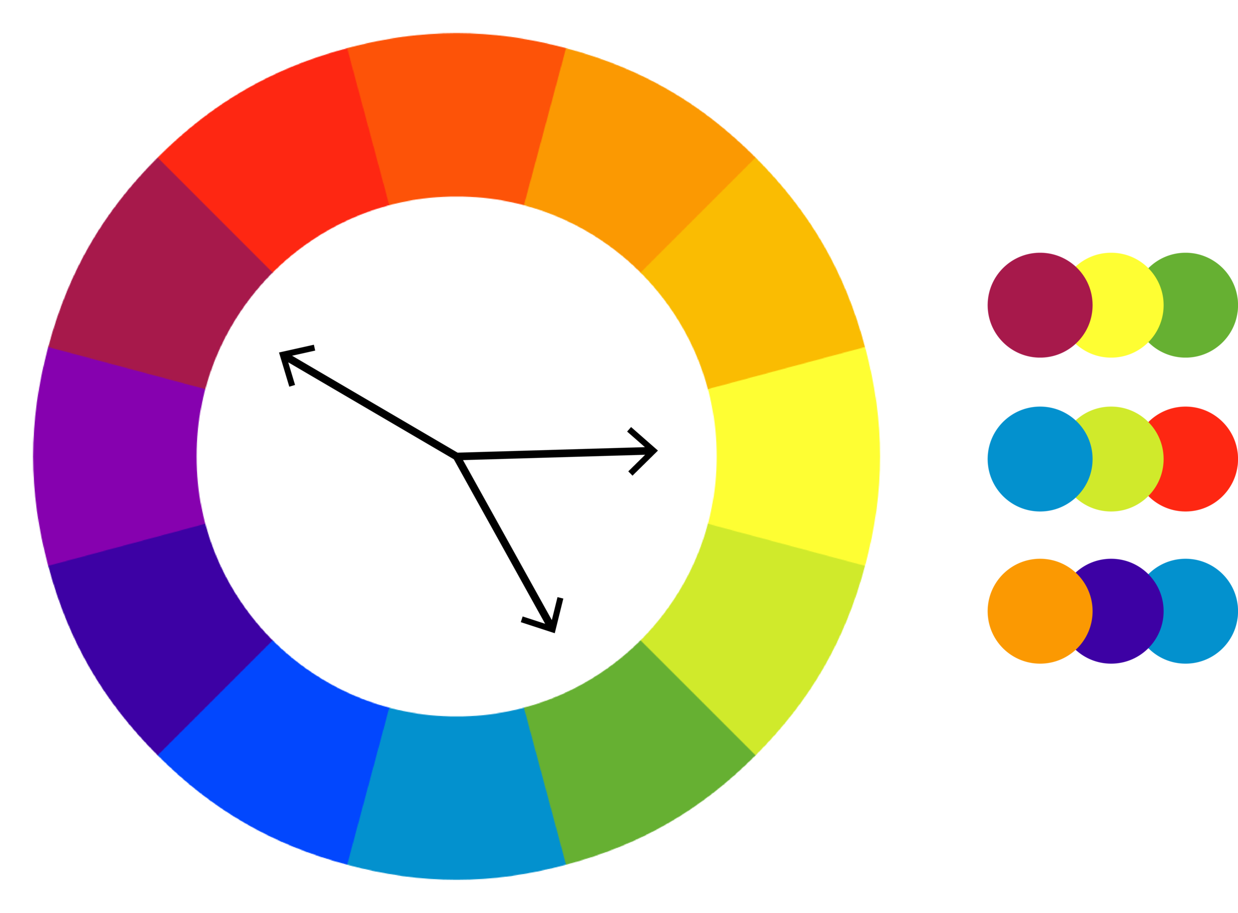
TRIADIC COLORS

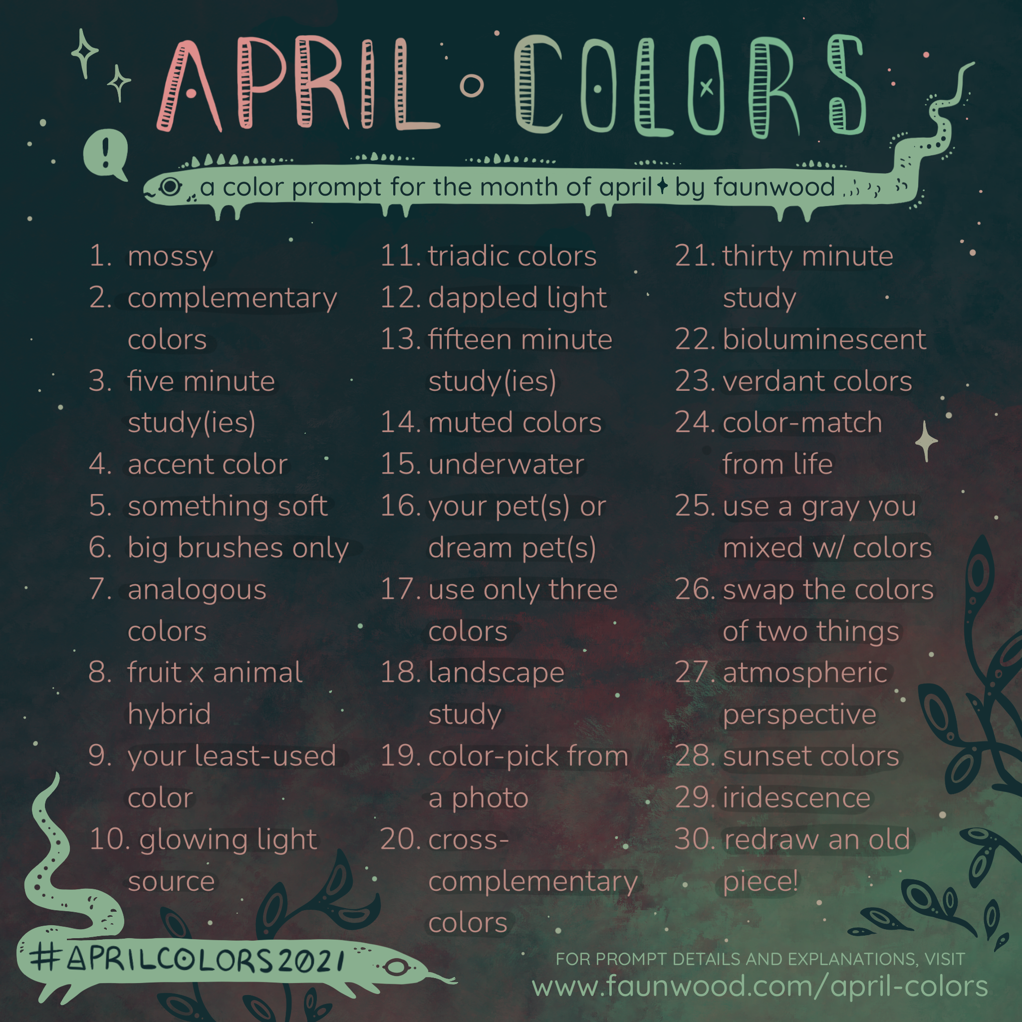
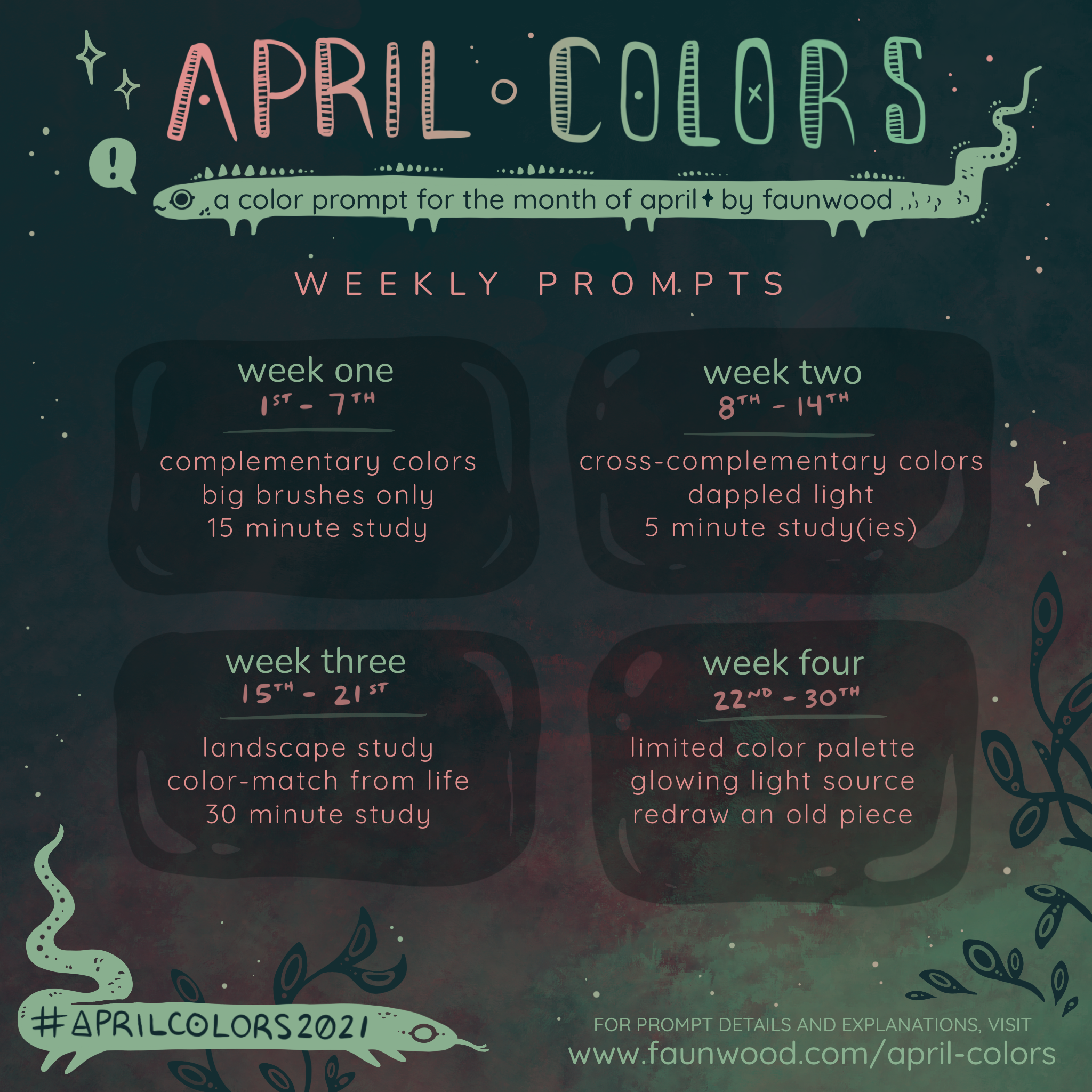
April Colors 2021
Thanks for visiting the "April Colors" 2021 prompt page! See below for the full prompt list and explanation. Use the instagram hashtag #aprilcolors2021 to share your work and follow along. To view participant work, you can follow the #aprilcolors2021 hashtag, or click here!
_______________________________________________
✧
Mossy – Just paint a mossy friend!
Complementary Color Scheme – Complementary colors are colors that are opposite each other on the color wheel. The goal is to create an illustration or study using a pair of complementary colors.
5 Minute Timed Study(ies) – Anyone remember art class? The goal is to see how much information (values, etc) you can capture in a given amount of time. If you want to spend more time practicing today, you can do several of these! It’s best to use a physical reference that you have in front of you.
Accent Color – A color that “pops” in it’s surroundings. This could be a very saturated and bright color amongst muted colors, or a splash of yellow in a sea of blue. It’s up to you!
Something Soft – This one is a bit of a texture challenge. Illustrate something that appears soft and luscious!
Big Brushes Only! – Paint something using a big brush! What counts as big? Anything bigger than you would normally use is a good place to start! I will probably use a 16 round and a 12 flat.
Analogous Color Scheme – Analogous colors are colors that are next to each other on the color wheel (see the diagram to the left). The goal is to create an illustration using a set of analogous colors!
Fruit x Animal Hybrid – Probably self-explanatory. Just take a cool animal and a cool fruit and mash those bad boys together!
Your least-used color – Use whichever color you use the least… and be honest!
Glowing Light Source – This is more of a lighting study than it is a color study, but it’s still a fun challenge! The idea is to paint something that is being lit by a glowing light source. Think of fireflies, candlelight, or magical glowing blue bubbles!
Triadic Color Scheme – A triadic color scheme is created by choosing three colors that are evenly spaced from each other on the color wheel. For example, blue-green, red-violet, and yellow-orange.
Dappled Light – Another lighting study! Think about the light that shines through tree leaves and casts a dappled shadow.
Fifteen Minute Study(ies) – More art school! Refer back to how you did the five minute studies, but now you have more time to capture more information!
Muted Colors – This is something I’m really bad at and need to practice! Muted colors are duller and less saturated. Here’s a tip if you’re using a traditional medium such as paint: If you want to desaturate a color, mix in a little bit of that color’s complement. For example, mixing a little bit of green into your red will desaturate it, as will mixing some blue into orange.
Underwater – What does it take to make a subject appear (convincingly) underwater? Blues? The reflection of light rays beaming from the surface of the water? Time to figure it out!
Your Pet(s) or Dream Pet(s) – This one is for fun! Just use your craft to show everyone your pets, or the pets you wish you had!
Use Only Three Colors – Also considered a “Limited Palette”, using only three colors is a great painting exercise. You may interpret this as using only three tubes of paint (plus white) and mixing between them as you please, or strictly sticking to three exact colors (with no mixing) for a more graphic result. For an added layer of randomness, you can use a website like https://www.random.org/colors/hex to randomly generate three colors!
Landscape Study(ies) – My personal Achilles’ Heel. It doesn’t need to be elaborate, but practice rendering an environment or landscape! If you’re like me and really need the practice, multiple timed studies might be a good way to go.
Color-pick from a Photo – For this day, use a photo to determine your color palette! Unsplash is a great resource for artistic and free-to-use photos, and Canva is a great place to upload the photo and generate a color palette! You can, of course, use your own photos but you should always ask for permission before using someone else’s photo.
Cross Complementary Color Scheme – Also called “Split Complementary” Colors. This color scheme is created by choosing a color on the color wheel, and then using the two colors next to it’s complementary color. For example, if you chose green, the complement of green is red. The two colors next to red are red-violet and red-orange. So your split complementary color scheme would be green, red-violet, and red-orange. You can also refer to the graphic on the left for a visualization!
Thirty Minute Study(ies) – Same as the previous timed studies, only this time you have thirty minutes! Practice getting as much information as you can down on the paper in the given amount of time!
Bioluminescent – Pretty self explanatory! Paint or draw something that is bioluminescent; real or imaginary.
Verdant Colors – The definition of verdant is “green as the color of grass or lush vegetation”. Paint something with this in mind!
Color-Match from Life – This is an exercise in mixing paints to accurately match the color of something in real life. If you hole-punch a piece of white cardstock, you can hold it up to the object you’re trying to match to isolate the color! Viewing the color against a white background can help make it easier to copy.
Use a Gray You Mixed from Colors – Use anything OTHER than black to mix your own gray and use it in an illustration! As an example: Ultramarine + Burnt Umber make a very convincing black/gray, but it can be fun to play with other combinations.
Swap the Colors of Two Objects or Animals – If you’re out of ideas, you can scan the room around you. Or, just pick two things that you love! Swap the colors/textures of a crocodile and a strawberry! Or a flower and a popsicle! Whatever you think will be fun!
Atmospheric Perspective – Also often referred to as Aerial Perspective. This refers to the shift in color intensity of objects as they become farther away from the viewer. This piece from last year is a great example of Aerial Perspective! Google images is also full of common examples.
Sunset Colors – Think of those amazing pinks, purples and yellows!
Iridescence – From Wikipedia, “Iridescence is the phenomenon of certain surfaces that appear to gradually change color as the angle of view or the angle of illumination changes. Examples of iridescence include soap bubbles, feathers, butterfly wings and seashell nacre, as well as certain minerals”. It can be very difficult to capture this in an illustration, so this will be good practice!
Redraw an Old Piece – Reimagine an old black + white piece in color, or see how far you’ve come by repainting an old color piece!